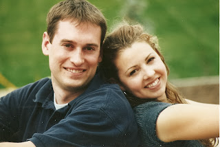
Please send me feed back and which one you would use for your adoption profile if you were me.
#1
#2
#3
Or none of the above. Love other suggestions. Should I do one with my latest hair cut???
As of late I haven't been doing much creating.
13 years ago


8 comments:
Don't you have an engagement picture with a blue background, I love that one. It's a closer up one. I like the first one, but I would play with in photoshop and lighten it up a bit, it's dark. I would love to see a few more options. The second one is great in that it shows your energy, but you look very young- I don't know if that is an issue or not. I would love to see some pictures with your new cut too!
I liked the last one best, but I'd love to see a few more too.
I agree with Kjirst on almost every point. I think you could be taken for a teenager on the second-especially with the braces. I love the first, just think it needs a little work. I think the third is a great picture-but a little dated.
Brigette and Dave,
First of all you both look respectively beautiful/handsome in all three but here are my impressions of some nuances that viewers might pick up on at some level.
#1 has a nice backdrop but since you are smaller within the frame it might make you appear distant. Also, your postures are kind of closed and stiff (for example, your hands are in your pockets and you look like you might be a little cold). This is a cute shot but these may be impressions people could have.
#2 shows your eyes well, some of your personality, that you are active (you're at a sporting event), and that you love and have fun with each other, but it also makes you both appear young (as Kjirsti said) and a little spunky (which could be viewed as good or bad) and may not emphasize your responsible side.
#3, although somewhat dated (as Sabina said) and more formal, is also close up enough to show the goodness in your eyes (which I think is powerful). Additionally, your pose reflects your affection for each other while simultaneously demonstrating your more conservative and responsible side (the color of your clothes is coordinated and your hairdos are extra nice in this picture) which could be important.
I think it comes down to what first impression you want to make with your profile picture. Again, you both look very beautiful/hansom in all three shots but I think they each may emphasize different aspects of your personalities and relationship.
Trevor took the words right out of my mouth.
Seriously, I like #3 the best because you can see you more close up. I don't like to have to guess at what someone looks like. Think about all of those wedding invitations you get where you can't see one of the people close up--I always wonder if they have some terrible hairy mole or something.
I really like your new haircut, so you should get some closer up shots with your new cut which makes you look older.
#3
I like picture #2. Remember, these are going to be teenage girls looking at these photos. They're going to want someone young, fun and cute to raise their child. Better yet, show the photos to some teenage girls and ask them which one they like best!
I know you don't know really who I am, but I use to go to school with Craig and Sabina. Our parents are in the same ward. My maiden name is Layton. Anyways--We have adopted 2 throught LDS Social Services. The best advice I can give you about pictures is close ups and recent photos. The birth parents want to see you and not the pretty background. Also if they meet you, they want to see what you really look like now, not a few years back. I hope this helps. If you have any other questions I would be happy to help. misty@meldrum.org Good Luck!!!
Post a Comment